
Tono & Lims is quickly becoming a favorite. Their ink names are fun and colors are quirky. They make ALOT of ink releasing many different collections of ink, it can be a little intimidating.
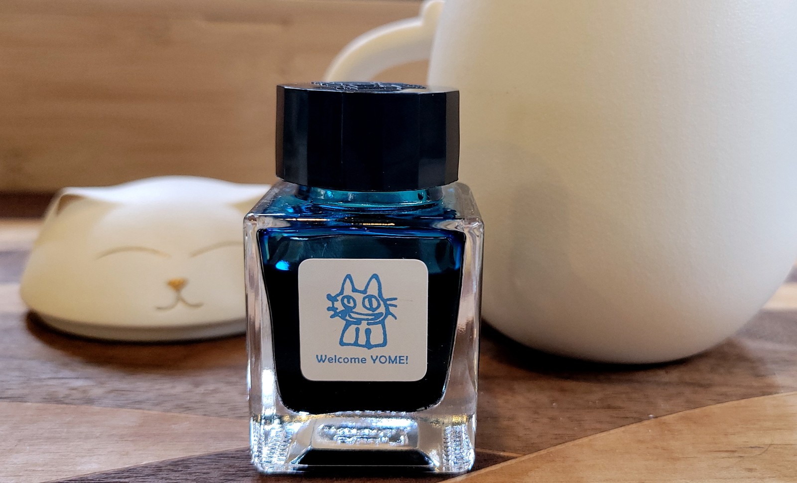
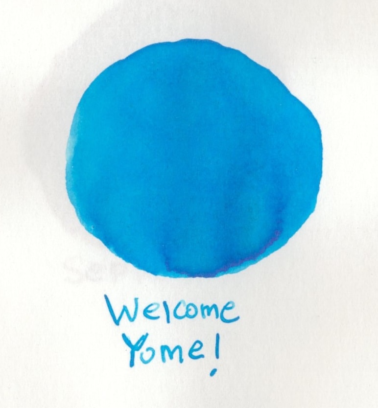
Welcome Yome! is the first ink I picked up from the Friendship line. The bottle has a cute little cat on it, and I couldn’t resist. I do love a good blue and this is exactly what you’re getting in this one. This ink is a standard medium blue with shading throughout.
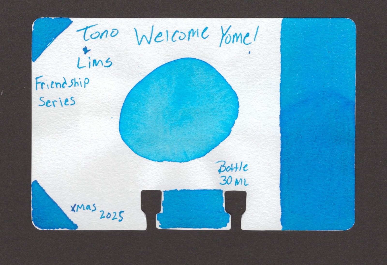
Swatches
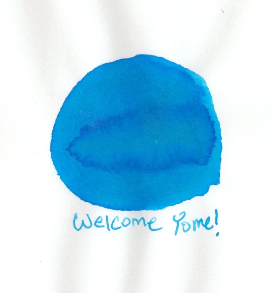
The Col-O-Dex card is a vibrant medium blue and shows that shading on the right hand side. The middle circle is 1 to 1 water and ink.
This is on Tomoe River S paper. The shading comes out here too.
This is on Graphilo Paper. This also shows off some of the shading, but not as much in the swatch. It does show off those vibrant hues.
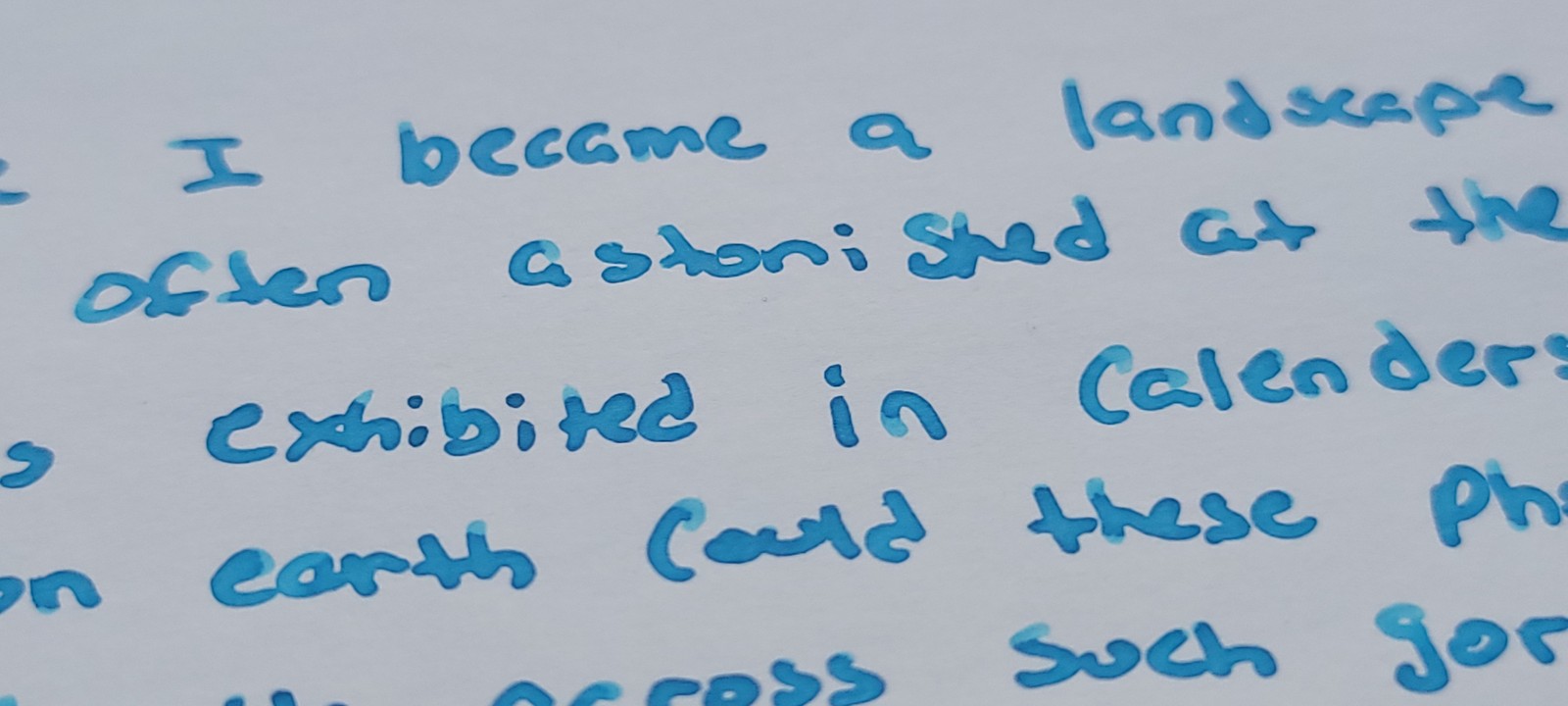
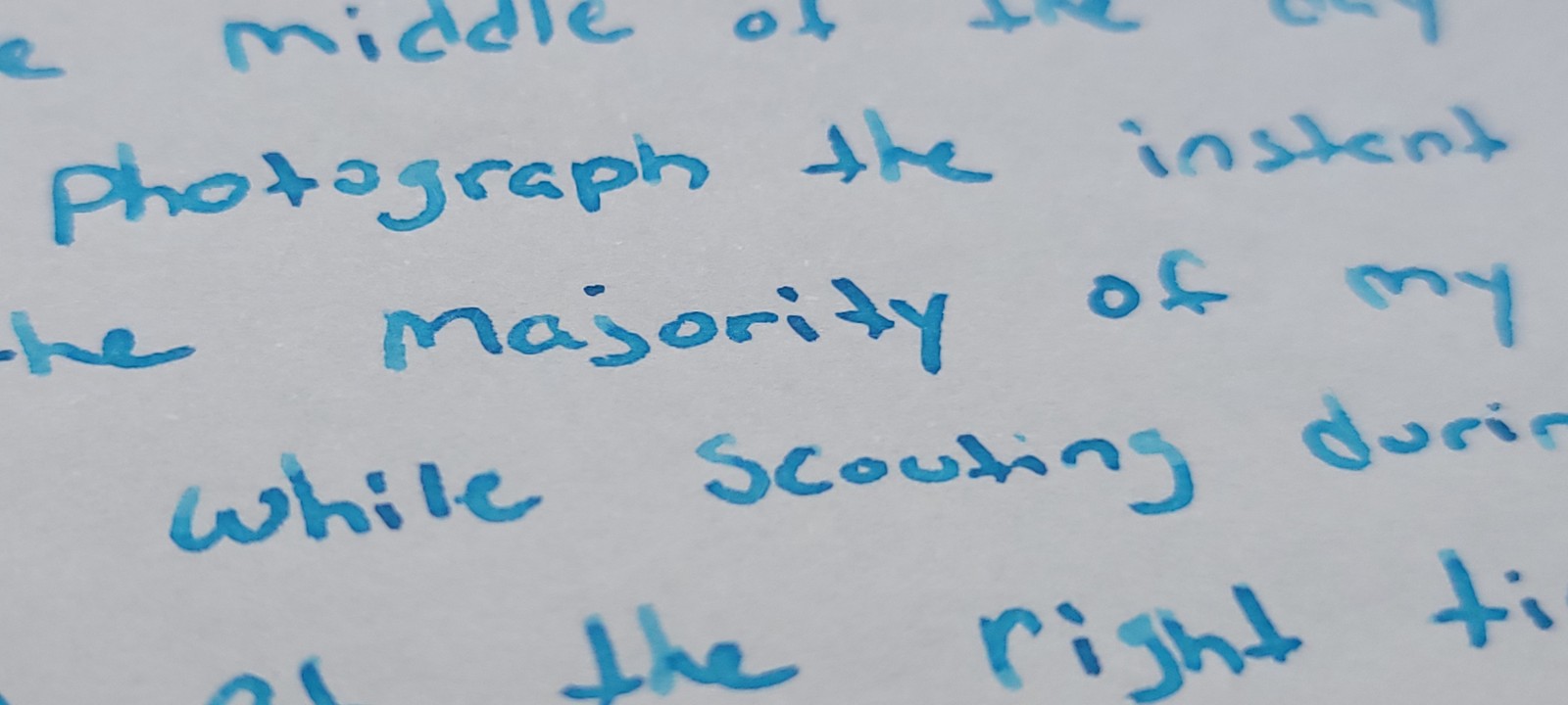
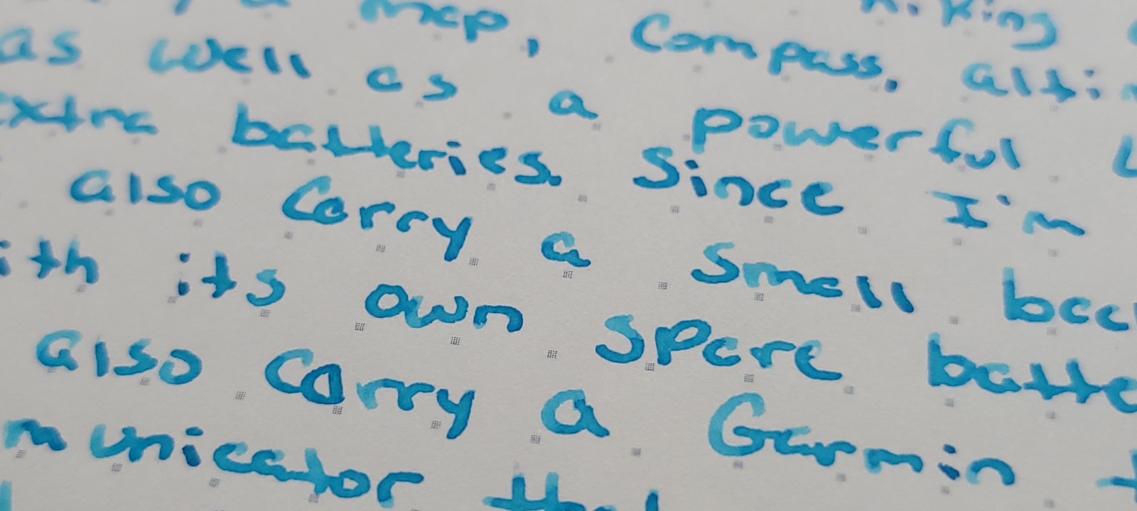
Long writing samples
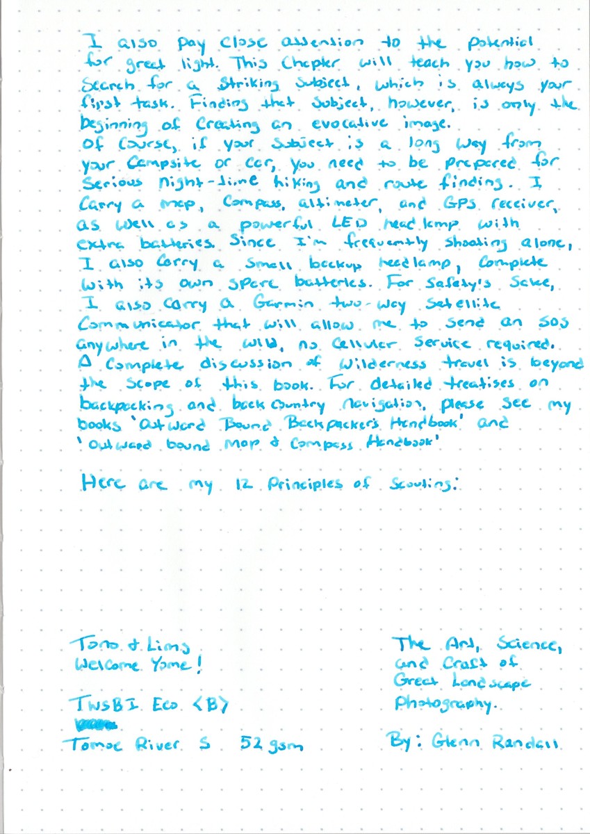
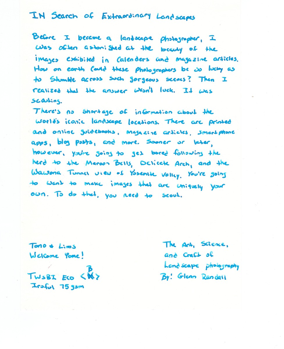
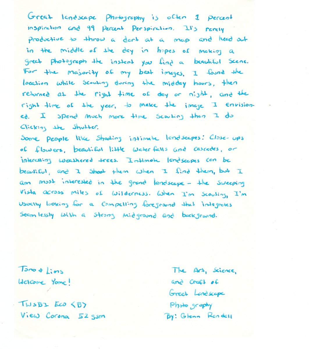
Longer writing samples were done on three types of paper. Tomoe River S 52gsm paper, Iroful 75gsm paper and View Corona 52 gsm paper.
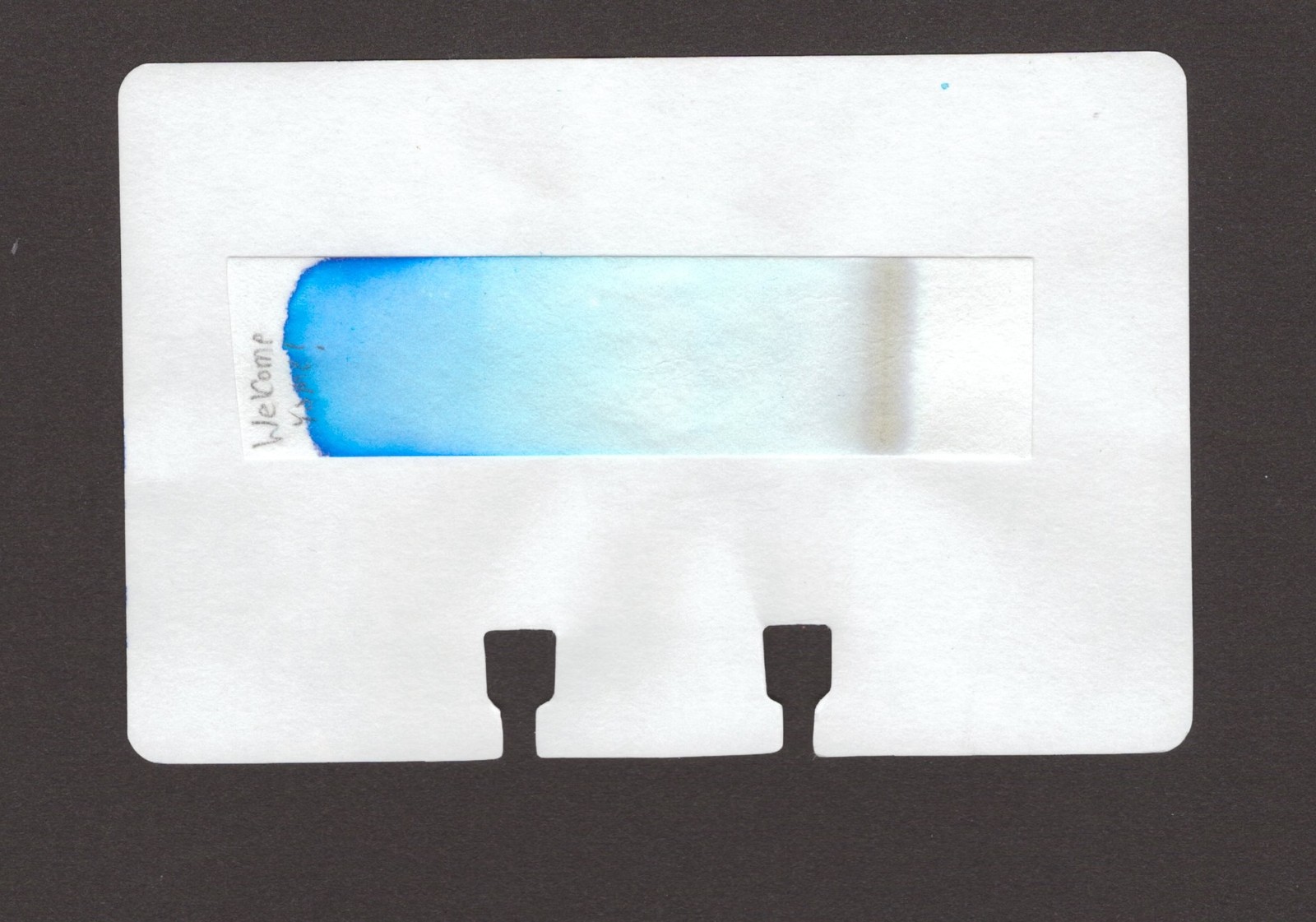
Here are some up close photos of the shading on Iroful and View Corona.
Wrap-Up Thoughts
The ink was nice to write with on all of the papers I used. I got a medium flow paired with the TWSBI Eco Broad nib. No feathering or bleed-through on any of the papers.
On the Iroful paper, the writing looks bluer then on the other two papers. Iroful tends to turn colors blue or in this case more blue. I tend to like that. Notice though that Iroful also appears to make the line wider, so if using a broad nib or bigger, that’s something to watch for.
View Corona paper is a thin paper and smooth, that offers just enough texture to provide good feedback and feel when writing. Not to mention I think inks look really good on View Corona.
Welcome Yome! showed off plenty of shading on all the papers, which lends a really pleasing touch. Just about every letter is getting the shade treatment. I think that very much so comes through on Tomoe River.
Overall, this ink is up my alley. I love a good blue and this one did not disappoint. I am eager to try more Tono & Lims inks.
PS - All ink reviews are my own and have been purchased with my own dollars.