
This has been entirely too long since my past post. Admittedly, the last few months of summer got away from me and this project was a wee bit intimidating! Nonetheless, I gathered different papers to test ink properties. I’m really interested in how the ink behaves, what ink properties show on each paper, and if the paper has a draggy-ish feel to it. This was quite the under-taking. I thought it would be neat to swatch each color on these different sheets.
Tools Used
Tools that I used to make these swatches. A dip pen of some sort. Two favorites that I liked using for this project are a glass dip pen from Kemmy’s Labo and the Pilot Iro-utsushi. I used both of these for writing the ink names. To do the swatch, I used the Ink Muddler from Dominant Industry. These really have become my favorite tools for ink swatching, although lately I’ve been diving more into the Kakimori nibs.
Iroful
I really like this paper and have several notebooks filled up with it at this point. It’s a 75gsm paper. It’s a coated paper and there is a pillowy or draggy feel when writing on it. I can really feel it when using a fine nib. It feels like I’m pushing the nib across the page. This is okay though, I do like the color representation on Iroful, it feels brighter or more saturated to me, and it’s known to color shift some inks. You’ll see this as I move through the papers. Keep an eye on Sailor Manyo Uri on page 3. Also, I like how Iroful shows off ink characteristics, especially shimmer and shading.
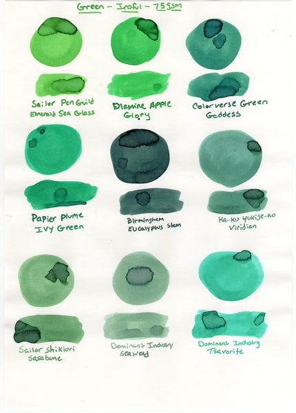
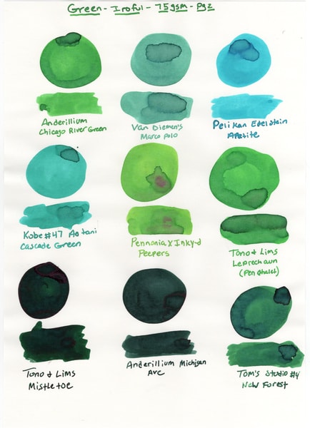
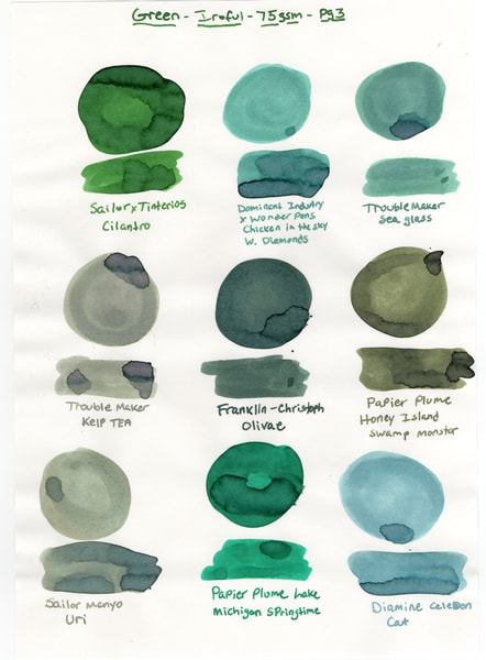
Green inks swatched on Iroful paper
Cosmo Air Snow
Next up is Cosmo Air Snow. Cosmo Air Snow from what I can tell is similar to CAL (Cosmo Air Light), both are 75gsm and both have a smooth surface that also creates drag on the nib, similar to Iroful. I believe the difference between CAS and CAL is the paper color. CAL is a warm white where CAS has more of a neutral tone. Cavet, I have not used Cosmo Air Light. I like again how Cosmo Air Snow shows shimmer and I see hints of sheen in certain inks, like Tono&Lims Mistletoe and Anderillium Michigan Ave. CAS also feels more saturated, the colors are bright to my eyes.
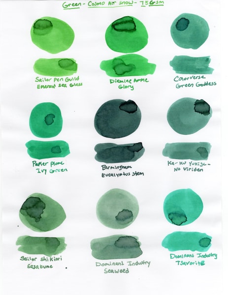
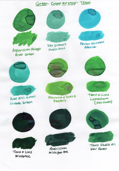
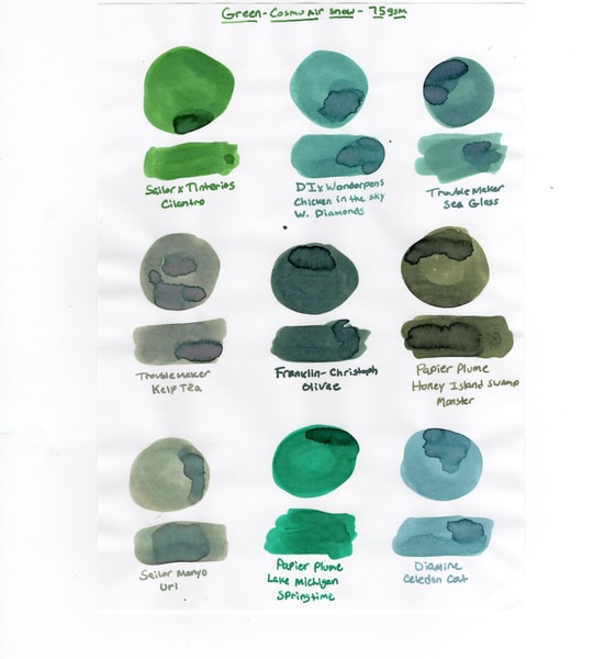
Green inks swatched on Cosmo Air Snow
Life Bank Paper
What really kicked off this entire project was finding Life Bank paper at the beginning of the summer. I had been hearing about Bank Paper and it was recently discontinued, although as of this writing is still readily available. Life Bank paper is a 86 gsm paper, it’s a toothy paper. People seem to either don’t like it or really like it. I liked it. Colors popped and color representation was what I’d expect. No color shifting of the inks. This paper showed off sheen and shading very well, this is seen again in Tono&Lims Mistletoe, Anderillium Michigan Ave and Tom’s Studio New Forest. Shimmer pops on this paper also, as seen in PennoniaxInkdependence Peepers and Tono&Lims Leprechaun. I’m really glad to have picked this up and will certainly be using it for writing.
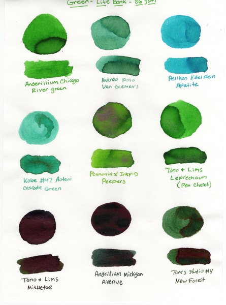
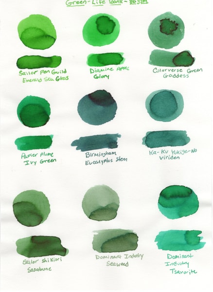
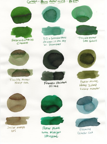
Green inks swatched on Life Bank Paper
Yu-Sari
Yu-Sari is the heaviest of all the papers that I tried, coming in at 95gsm. No color shifting on the inks and they were nice and saturated. Shading really came out on this paper as did sheen. Shimmer to my eye was hit or miss, or maybe that’s just how I swatched it? However, I thought shimmer was represented less on Ya-Sari then some of the above papers. Not a deal breaker for me. Writing was smooth from a fine glass nib. I became a big fan of Yu-Sari paper and went out and got a notebook of it for journaling, Logical Air.
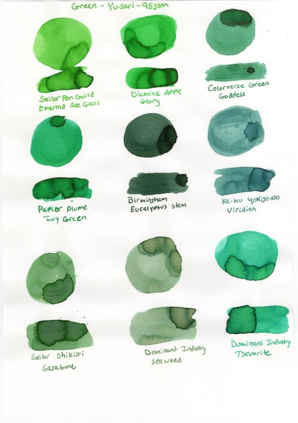
Green inks swatched on Ya-Sari loose leaf paper
View Corona
View Corona was new on my list and I was curious about it. I saw loose leaf sheets available on JetPens and decided to pick it up. This is listed as a white paper but seems more of an off-white paper. It’s very crinkly, and I think I really like that, but maybe not for everyday journaling? It’s a 52gsm very similar to Tomoe River. This paper blew me away in terms of ink characteristics. Shading, shimmer and sheen were all present. Shading on this paper is very apparent and as far as sheen goes I was able to see blue and red sheen in Tono&Lims Mistletoe. I really want that to come through in the scans, I’m not sure it did. Which is a shame because it’s striking. I was shocked when that came out. This also quickly became a favorite and I think I might make a notebook out of the loose leaf that I have.
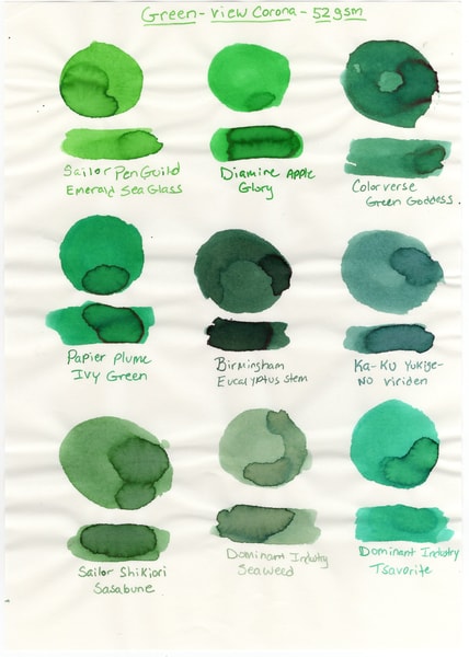
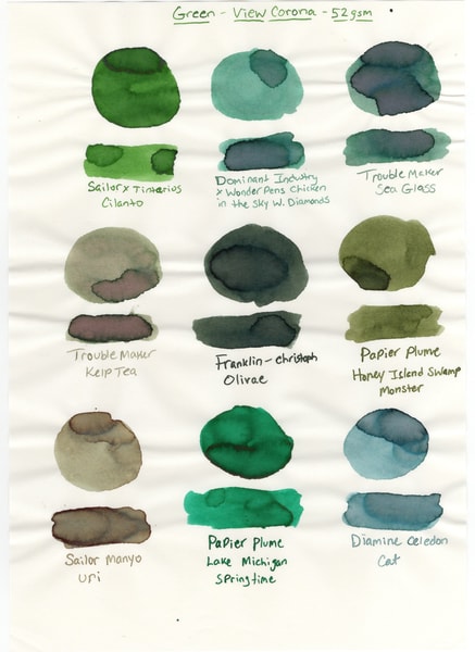
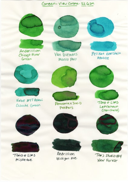
Green inks on View Corona paper
Tomoe River
Everyone knows Tomoe River. This was sort of my control paper since it’s very well known. This isn’t the famed Tomoe River or anything like that. I cannot source that. Tomoe River is 52gsm and crinkly. Which is very pleasing. Shading, shimmer and sheen are all very well represented. Colors are saturated and bright. I think Tomoe River is a solid paper. Sailor Manyo Uri was darker on TR than anything else. So was Papier Plume Honey Island Swamp Monster. This version of TR felt smooth when writing with a fine glass nib. I wish I could compare to the OG Tomoe River, but I cannot.
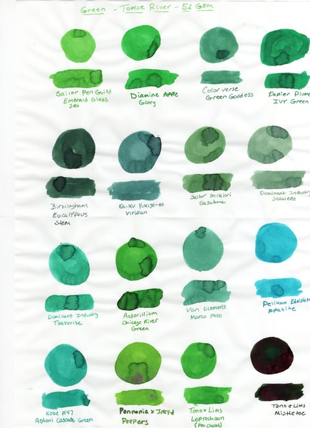
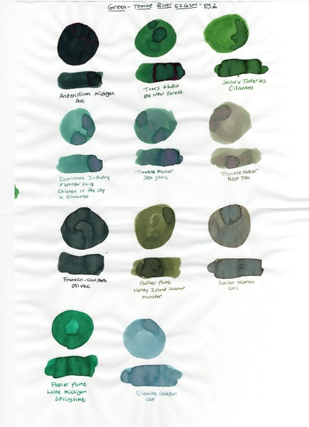
Green inks on Sanzen Tomoe River paper
Overall
I think all of these papers will show off ink properties well, depending on the ink properties you want to show off in your writing or based on which ink you’ve chosen to write with. There really is no wrong answer here. Ultimately, my favorites were Ya-Sari, View Corona, and Iroful. Your favorites may be different!
I did this experiment and then put it down again when it became a little overwhelming. When returning to it, I found that I didn’t swatch the rest of the colors in all the papers. So I have some homework to do for the next round. I may add another paper (although I may not). I have two papers that I didn’t do this experiment with and since this was done, I’ve added more ink in all the colors.
I hope this was informative, or helpful to someone. It was to me, I thought it was neat seeing color shifts on Iroful and sheen colors that I didn’t know were present on View Corona.
PS - All the paper was purchased my me with my own dollars.