
My year and a half journey into fountain pens has lead me to be curious about flex nibs. Modern flex nibs. Why? The writing experience. I’m so fascinated with how the line looks on the page. I realize these nibs don’t compare with vintage flex nibs, however, I’ve not had the opportunity to play with vintage flex nibs.
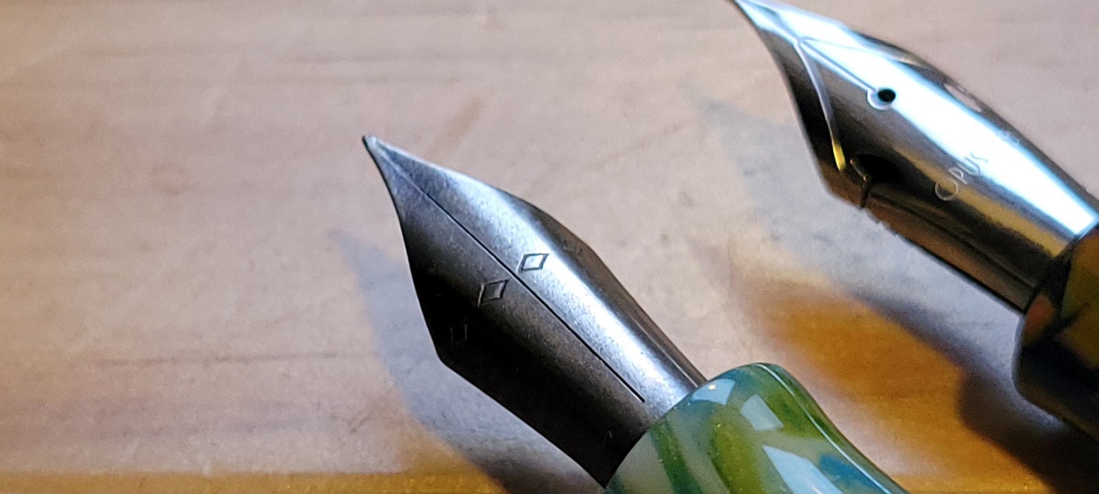
Modern flex nibs are a little softer of an experience and can be pushed to get that line variation. My first modern flex-nib was the Opus 88 flex-fine. This is how I got really interested in the line variation. But this isn’t a post about the Opus 88 flex nib (JoWo #6). Nor is it a comparison to other flex nibs.
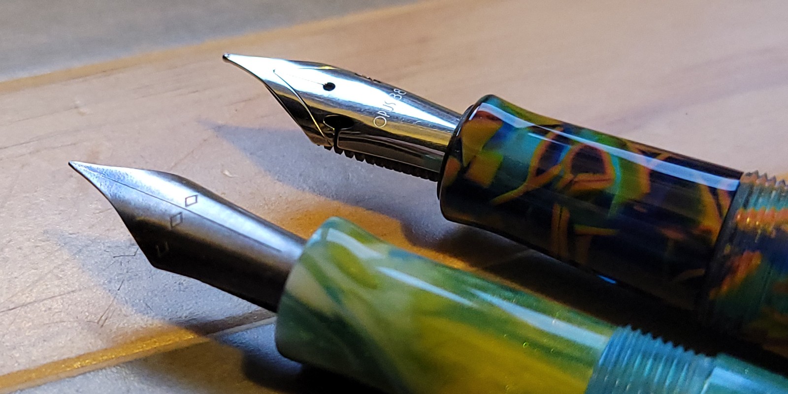
I was intrigued when a few weeks, maybe a month ago Franklin-Christoph released a flex extra fine nib in titanium. The nib also came with an ebonite feed. I’ve never used an ebonite feed before. According to F-C the nib is JoWo #6 shaped and will fit in pens that accept a JoWo #6. I was also curious about this. So I ordered one and promptly fitted it into my Hogtown x Enigma PDX (which has definitely become my favorite pen of the year) and filled it with Rohrer & Klingner Blu Mare ink.
I used this combo over a month’s time in my journal. At first, I thought wow the nib is really firm. Over time and more usage I found the nib to loosen up a little more and become more bouncy. I could write lighter and saw more line variation on the down-stroke. What really captured my attention, was the ink flow from the ebonite feed. It felt like I was putting more ink on the page in general writing. I was concerned with bleed-through, however, in my journal the Life paper stood up very well as did the Iroful paper when I switched out to that notebook for everyday journaling. Both held up just fine, and the R&H Blue Mare isn’t a particularly wet ink. It’s medium, and it paired with the ebonite feed very well.
Writing Tests
In addition to my everyday journaling I wanted to test the line variation on different papers.
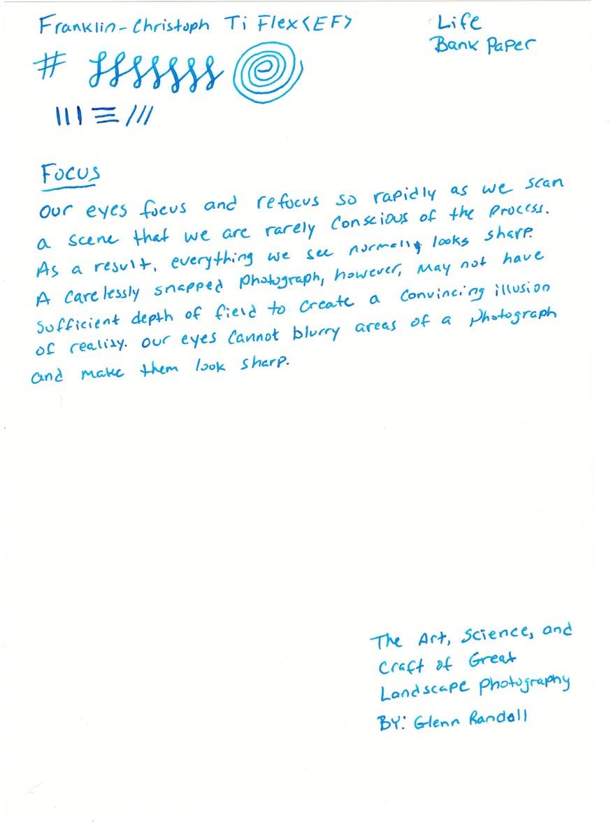
Life Bank
First up is Life Bank Paper. Life Bank has some texture to it so I was curious how if at all it would effect the writing. Actually, it didn’t in my opinion. And Life Bank is where I got a good amount of line variation.
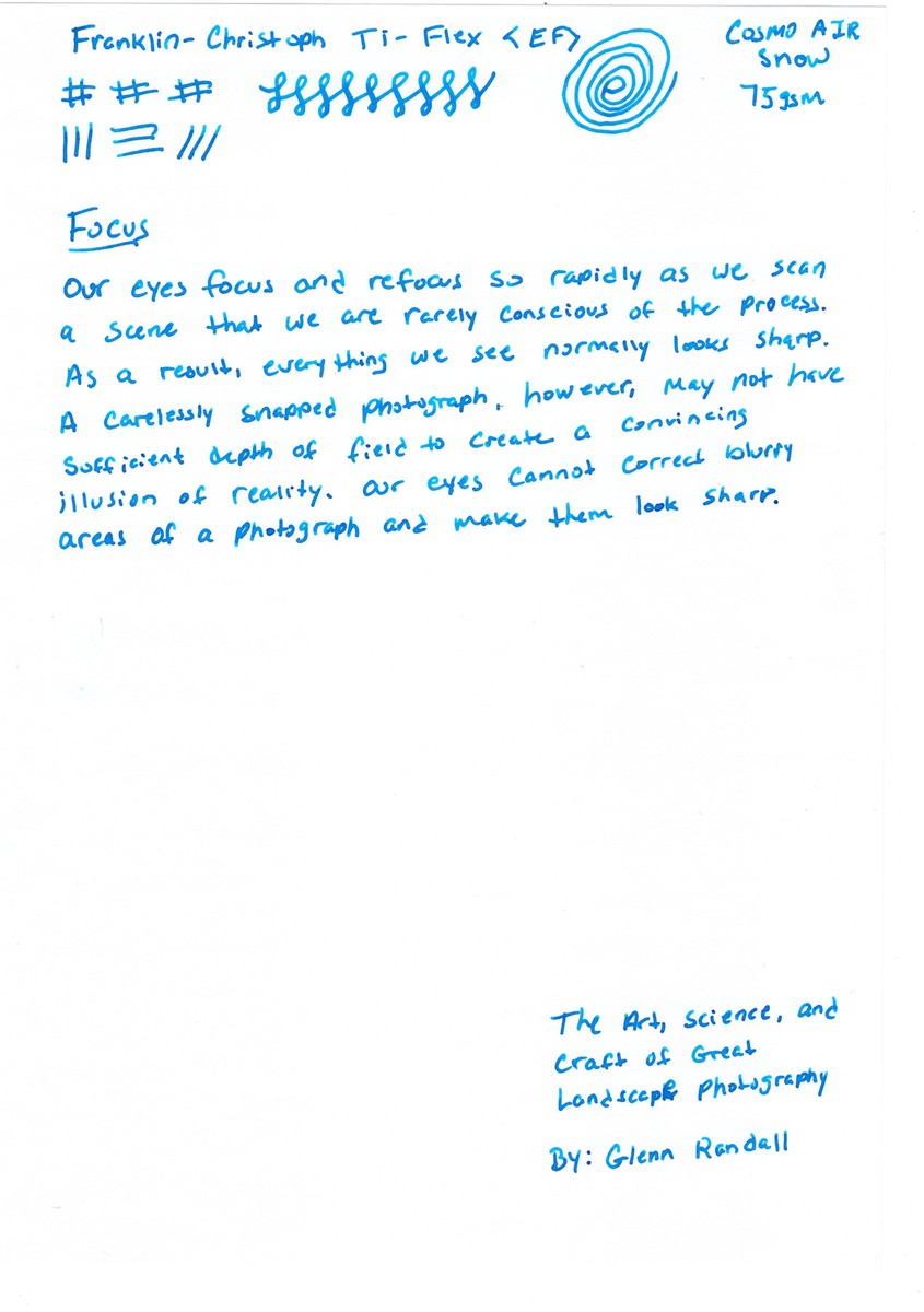
Cosmo Air Snow
Cosmo Air Snow is a heavier paper, pillowy. However, the writing here was as smooth as ever. The line here is thicker and I don’t think there is much variation, even still it’s a beautiful line and I can even see some of the sheen in the ink in various places. Not many, but it’s there if you look closely. This paper also brought out shading. I think these two properties is an effect of the thicker line.
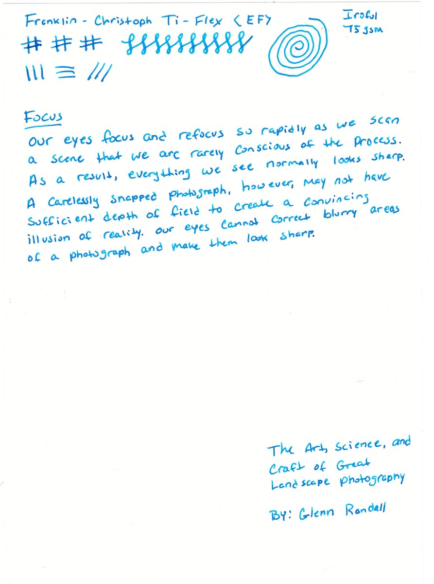
Iroful
Iroful is similar to CAS above. It’s a heavier paper and feels pillowy. However, here too I was again surprised at how smooth the writing was with the EF nib. Not draggy at all. Again, the nib puts down a thicker line here, although I can see some variation in the loops as opposed to the down stroke. There are a few areas that if I look closely, I can see the sheen in the ink and shading is both present. Again I think this is the effect of the thicker line that this paper displays.
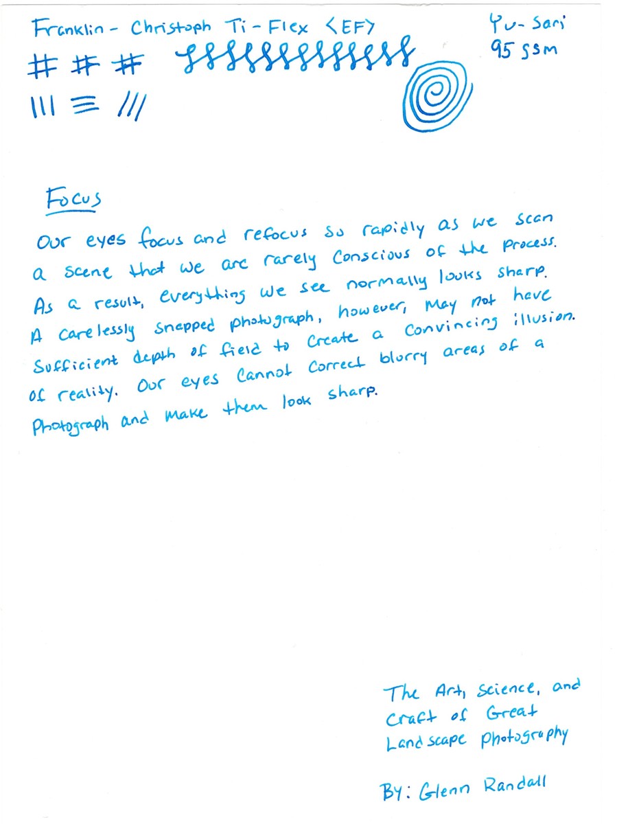
Yu-Sari
This is the same thickness as both CAS and Iroful, however, Yu-Sari is a smooth paper. Writing on this felt very nice and pleasant. I was able to get very good line variation on this paper. And overall, this turned out to be my favorite.
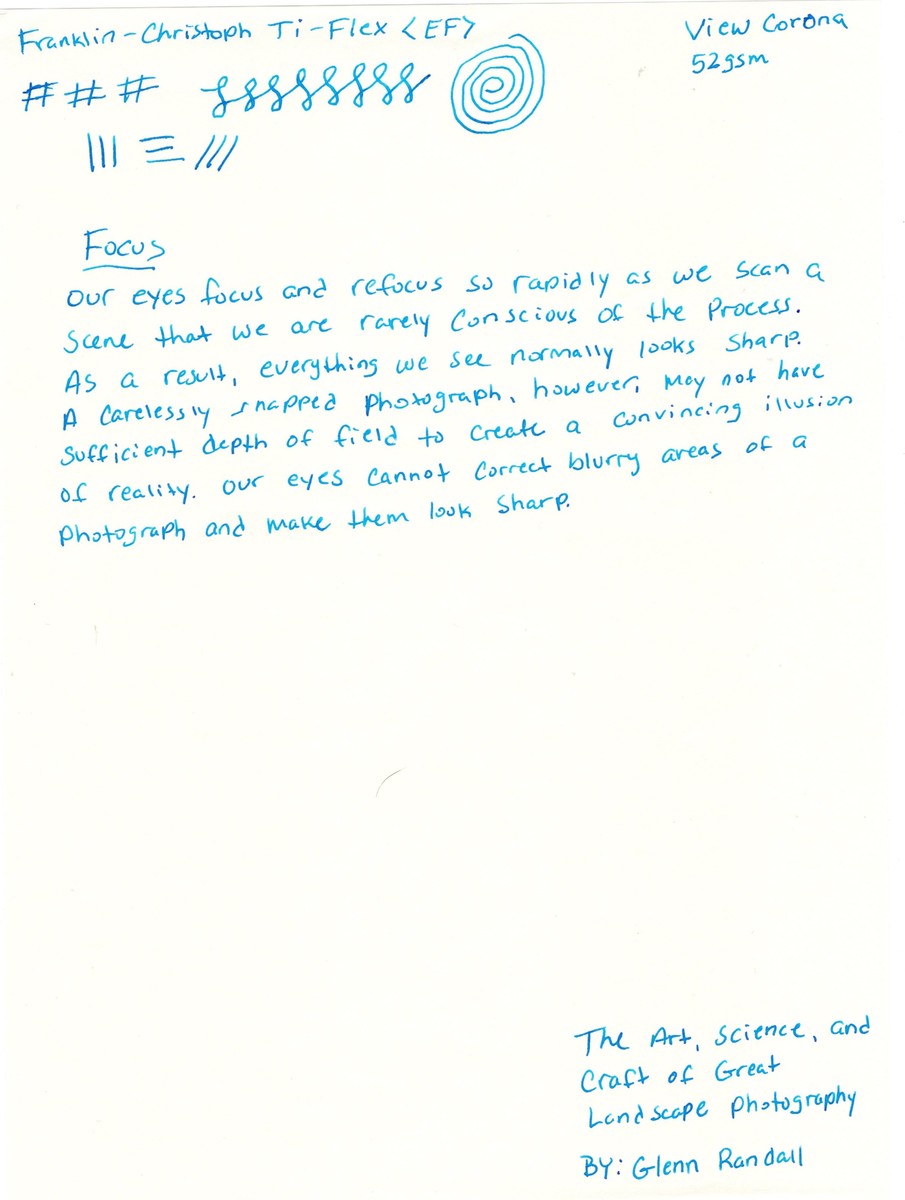
View Corona
View Corona is the thinnest of the papers I test, coming in at 52gsm. It’s a smooth paper and nice to write on. Here though I felt that I didn’t get the line variation at all and the EF nib was just that, an extra fine line. I was able to see some sheen come through, however, this paper is very good for showing off ink properties, although that wasn’t what I was testing this time.
Final Thoughts
All of the papers tested here handled the flow of ink very well, there was no bleed through at all, nor would I expect there to be even with the ebonite feed laying down more ink. I can definitely see myself using the TI-flex as an everyday writer and it may even have found a permanent home in my Hogtown PDX. I had no issues with the ink, and it dried in a very reasonable amount of time. Given though I don’t find that Rohrer & Klingner Blu Mare is an overly wet ink. The refill might be a wetter ink to see how using a wetter ink changes the ink flow with the ebonite feed. The nib itself started out feeling stiff, and over time loosened up to a nice bouncy writer.
I will say though that while I don’t write in cursive, sometimes words do come out in cursive, especially those words with double letters. Otherwise, I don’t consider myself a cursive writer, that doesn’t mean line variation is lost on me. I think using a modern flex nib can give my writing a little flare, hmm maybe.
DISCLAIMER: Nibs and pens were all purchased with my own dollars.