
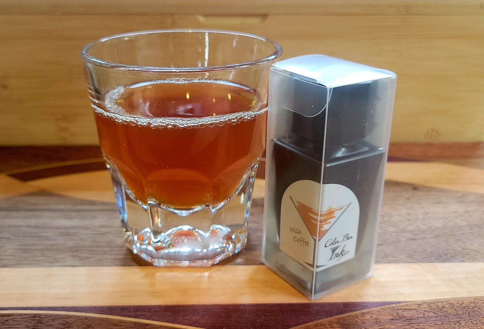
A little while back Vanness introduced Ishimaru Colorbar inks to the US. Ishimaru is a stationery chain in Nagasaki, Japan. Their exclusive Colorbar inks are named after cocktails. I’ve not had the chance to ever see these inks so I was excited and promptly put 10 of these inks on my wishlist. Before placing an order, I had to cull the list down and decided on Gypsy, Wine Grog, and Irish Coffee. Ishimaru Colorbar inks come in 23ml bottles.
Irish Coffee is a light/medium brown-orange ink that seems to pop off the page. Especially on Iroful paper, where it feels brighter. I can see where it captures the mix of coffee and cream used in an Irish Coffee drink. The color is a cozy color that makes me want to curl up on a chilly evening in deep winter or early spring.
Irish Coffee looks beautiful on paper, it’s a heavy shading ink and I don’t have anything else like it in my collection. The downstroke shows the darker cozy orange, while the rest of the stroke shows the warm cozy brown. The flow feels wet from a Pilot Kakuno with a medium nib. Writing was smooth on all the papers that I tested and this led to a quite enjoyable writing experience. Lines were all nice and crisp. I did not see feathering, bleed-through, or spead from the ink. This is an ink that I want to keep inking again and again.
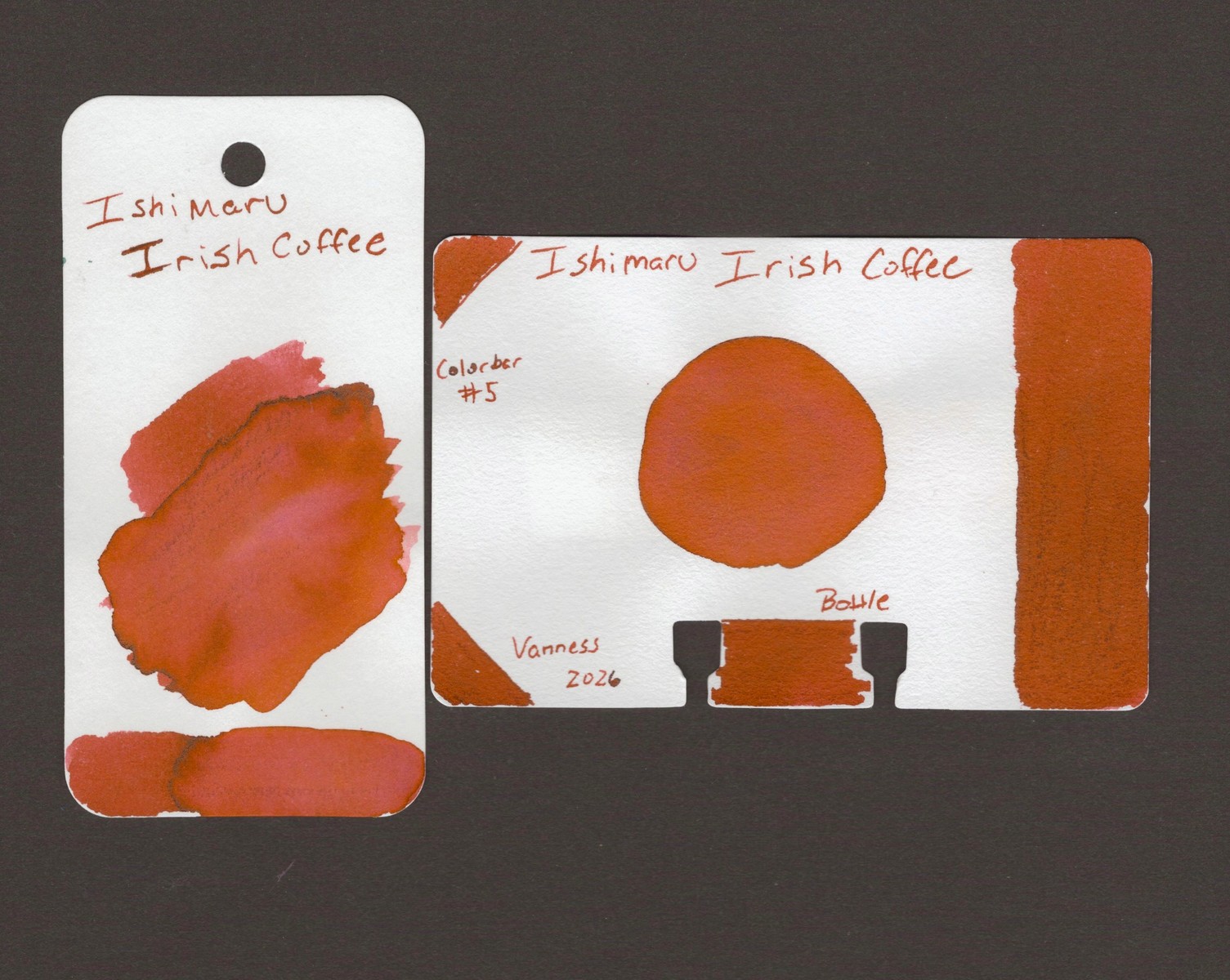
Swatches
The swatches are done on Col-O-Dex and Col-O-Ring swatch cards. Here in the larger swatch is a little bit of drark black sheen. You won’t see this in the writing. There is a subtle pink hue where I did a water wash on the coloring card. The cards both show a rich medium brown-orange color reminicent of an irish coffee right after mixing in the cream. Mmm.
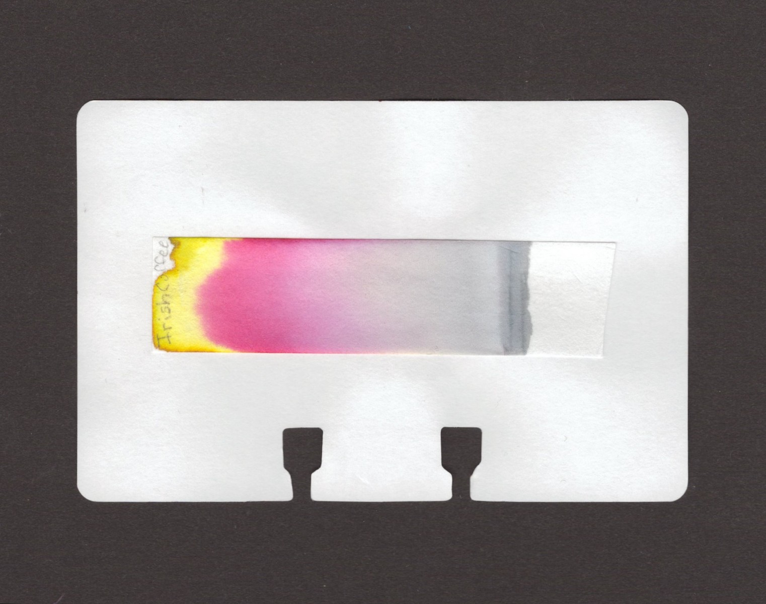
The chromatography is showing pink and yellow dye with a small hint of orange at the very top.
Long Writing Samples
I did six writing samples because I enjoyed writing with this color very much. It was relaxing and fun. The papers used are Nebula Note, Sanzen Tomoe River, Canopus, Yu-Sari, Life Bank, and Iroful.
Nebula Note is from Colorverse and I really like this paper. It’s a heavier paper coming in at 90gsm and feels like it has some tooth to it, however, the writing experience is very smooth. It shows off light shading in some areas. Mostly, the brown-orange color is going to come through on this one. The lines are nice and crisp and there is no spread.
Good ‘ol Sanzen Tomoe River. More shading is present on the TR paper as expected with the orange appearing in the downstrokes and the brown coming through on the up stroke. Lines are crisp with no spread.
Canopus paper is very nice. It feels slightly textured and yet is a smooth writing experience. The paper does show shading, I’d call it low shading and it’s more present than on the Nebula Note. The orange downstrokes and brown upstrokes blend nicely creating an even rich color experience on the page.
Yu-Sari is a smooth paper giving away to a smooth writing experience with this ink. Shading is also present here with the orange and brown blending on the up and drown strokes. The writing is crisp and even with no spread.
Life Bank Paper is a bit toothy and even still this was a nice writing experience. Life Bank is an off-white paper (Although the sacn makes it look stark white, it’s not) that sometimes can do weird things to ink. The color here is the same brown-orange, shading is low on this paper and not present in every word. Lines are again crisp and there is no spread.
Iroful is a pillowy type of paper, meaning that sometimes the nib can feel draggy across the paper. The color popped on Iroful and heavy shading is present again seperating the orange and brown on the up and down strokes. The color looks really lovely on this paper. Lines are crisp. No spread and enjoyable to look at, as if under crystals, if that makes sense? The color is vibrant on this paper.
Wrap-Up Thoughts
The ink was nice to write with on all of the papers I used. Even on the toothier papers I felt the experience was smooth. The flow was nice on all of the papers. Each paper showed a variation of the shading. Some low shading and some high shading. Each paper kept the lines crisp and there was no spread, ghosting or bleed-through. I very much enjoyed using this ink on Iroful. Iroful made the ink vibrant and pop off of the page.
Have you used Ishimaru inks? What did you think and what were your favorite papers to use?
PS - All ink reviews are my own and have been purchased with my own dollars.